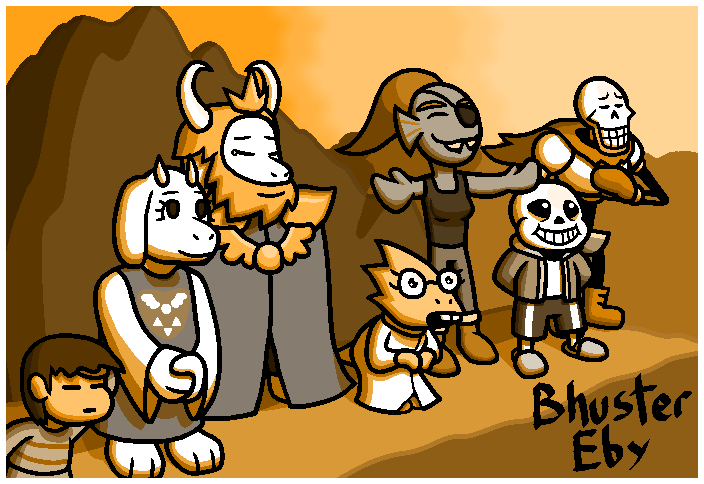
Backburner Art #13a- UNDERTALE (Pacifist)
Trying out stuff for backgrounds and shading, using Perspective tools, and signing in a new brush.
I have to say, I had so much fun playing through this game. I legit enjoyed being there for the story more than I did just watching someone play through it, or reading up about it.
Since I did the Pacifist playthrough, I figured I'd use the ending as the idea for this piece.
Originally I didn't plan on making this look like a snapped picture, but when nearing the end of this drawing I figured that it would make some things tie together. The picture effect was gained by use of a single color with the Hue blend mode, and a white border color that sat on top of that. I also used a new brush that I made, inspired by the fact that I have a calligraphy set and handbook. It's a brush that is very thin, wide, and at a perfect 45 degree angle at all times. I figured it made sense when I turned this into a picture, since it gives off the vibes of someone actually signing it, despite it not being in illegible cursive (not a dig on cursive, it's just that for my art I would like my username to be eligible, even if it is hidden within the art sometimes).
For the background, I tried to do a color for outlines that weren't black. I am honestly not sure how well I did there. I just made sure that parts of the outline were darker colors of the things they were attached to.
For the cliff that they're standing on, I used a Perspective tool from my Assistant Tool. It basically makes an adjustable, 3d grid that, if you zoom out far enough, showcases where the ends actually merge upon an unseeable horizon line. I used that, alongside checking the box on my brush tool that says "Follow Assistants," then giving it a lesser weight to follow it (at max, it follows it directly; I didn't because I wanted a more natural, rocky look).
The forest was made with just a single color, being drawn like a squiggly line, then filled in on the bottom half.
The sky was made using two ideas, the first being a thing I thought up of in the shower (I feel like I've done this before, but it also feels like the first time I've experienced it, it's weird), and the other is just a filter. I made an elongated box of color, with a shorter box of dithered pixels extending from it on the side, then made them stack unevenly on top of each other until they made it past the horizon of trees, at which point I duplicated all that and scooched it over a bit more towards the location where the sun would be and made it a lighter color. The filter was some sort of blur, which is why it looks so fuzzy up there. Which is fine, that was essentially the point of it, since I didn't want to use a single gradient, but I also didn't want to scribble a line. I took my articulateness and used it to my advantage.
I had fun actually drawing these guys. I remember only drawing sans. once, and that was to make a joke. Also my art style was god-tier, but multiplied by a negative infinity. So it was nice to draw these guys in my style. Papyrus was first, and I decided to keep his arms black, in order to keep my sanity on making them look good while being the way they were. I think I nailed his top half, but I admit the skull was a bit difficult to do first. It turned out well though. He's in his grandiose pose, which typically happens when he goes "...WHICH MEANS I, THE GREAT PAPYRUS..." and what have you.
Sans is a short stout skeleboy wearing baggy clothes to look like he's got meat on his bones. The head turned out well, and overall he was the most fun to draw. Who'd've guessed? It's not like he's the fandom's most favorite character or anything. I have him looking up at his bro, expression the same it always is, yet you know that he's happy because his bro is happy.
I wanted Undyne to look like she was enjoying the feel of a gentle breeze on the surface, or just enjoying the freshness of the atmosphere after being stuck in a bizarre cave system for years. I don't know how well I did it, but I will say she looks more like she's trying to give someone a hug. I don't know how I forgot she had an eyepatch, but it's cool.
I could've done a better job with Alphys. I could've made her bigger. She may technically have a shorter battle sprite, but that's because she's got scoliosis so bad she looks like her back is ready for her to reach and pick something up off the ground. She still has that with the way I drew her, but I could've made her bigger. Alphys looks like a little child due to that. Aside from that, I think the only other places I could work on is her mouth, but she looks alright design-wise. I gave her that expression because she was so excited to see the world.
Drawing Asgore was gonna be a weird mix between difficult and easy. Easy due to his figure always being covered by a big-ass cloak. Difficult due to his everything else. I had stopped drawing furry characters because, for me and my designs at least, they became not fun to draw anymore, which sucks. Despite this, I think I did well on Asgore. Muzzle looks like one, he's got his full mane, and his ears are there. The symbol of the brooch (or whatever the hell it is) on his chest was the top half of the Deltarune symbol (the full form you can see on Toriel's dress). I needed help with the wings, but it turned out fine. I had him cry silently to himself because, for all that he's gone through, he can finally shed some guilt and stress, and be at peace with himself.
Toriel has an optimistic look on her face. Not exactly what I was going for, but it does seem in-character for her, so it's fine. Much like Alphys and Asgore, I didn't really draw her base body before putting her in the outfit, I just judged like I did theirs. Hey, at least I didn't draw her with big muhumbo jumbigligios. Unless you're into that sort of thing, in which case sorry, I was going off of her sprite.
Frisk is just scanning the landscape. I like how they turned out for the most part. Their round head somehow turned out great. I used to draw heads like that, actually, but it didn't work well for me in the long run. I think it works on Frisk because of their completely neutral face, with Brock from Pokemon eyes.
If you look closely, I tried out doing a new shading technique. I did two layers of shading, with one of them being a lighter variant that covers more ground (i.e. the way I'd normally shade), and the other being for the parts further away from light (like the edges, or in cracks and places where the light isn't gonna reach well). For some characters, it works! Undyne's hair and Papyrus's chest, shoulders, gloves, boots, and cape all look sick as hell with it. For others... eh. This shading might not be for me, but who knows? I feel like they could be used great for shiny objects, since some of the parts on Papyrus (where his arms and other limbs connect to certain clothing) look like gold rings with how I shaded them.