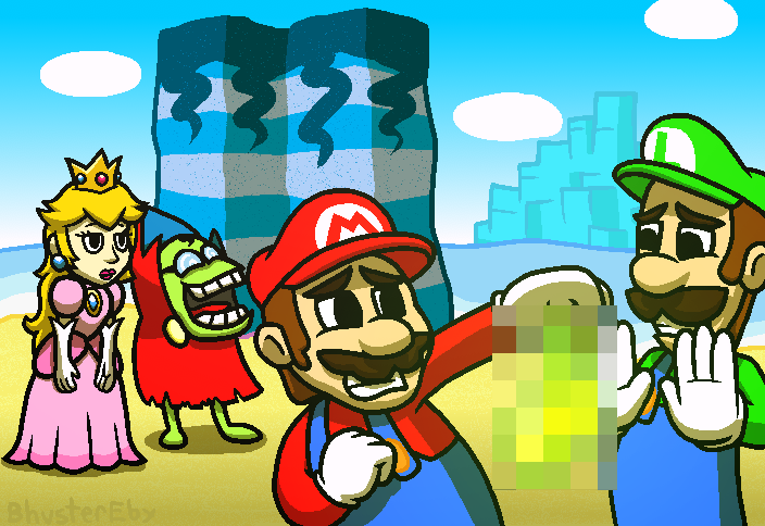
Backlog Art #32- Mario & Luigi: Superstar Saga
More background practice, design studies, better hands, different shading blend modes, and OH MY LORD WHAT IS THAT?!?
Would you look at that! I'm becoming an artist as we speak!
This feeling... WHAT DOES IT MEAN?!?
My art style is always constantly shifting, it feels. Sometimes it looks good, others bad. I feel like lately I have had nothing but good things to say about most of my art. I have gotten to the point where I might start thinking about documenting my style. It's been something I've wanted to do for a while now, but as of late it's looking more and more appealing. It would be nice to see and understand how my art works. It's just basically a set of rules for how one interprets things, after all. I've also been considering adopting another style for different things, because that could be cool.
Anyways, I've been getting better at drawing, and I feel like this is my best piece to date. Everything about it just feels correct, y'know?
Don't answer that, because I'm about to explain why it feels correct.
Superstar Saga has official art for all the characters I've used here. It's a distinct style, and I've seen someone break it down before. The main thing I remember is that it looks like it was colored with some sort of crayon or something(?). It's been a while, give me a break. So, I used these as a reference for their designs. This is the first time I have drawn Mario without a perfectly spherical or oblong circular head, and also the first time I have drawn his gloves as looking like hands, and not a sphere. Luigi... I've drawn him with his head shape more times than I drew Mario with his actual head shape, but it looks better here, plus the gloves thing again.
I first drew Mario in my Completion Art as far back as the first piece I've ever done: Super Mario RPG. Peach is also in that one, too. They both look rough. First time I drew Luigi was in the Luigi's Mansion piece, also one of the oldest ones. That one is also the only time I drew his head differently, as his head is not merged with his neck and oblong.
Now look at them here! Hell, if I had forgotten about drawing this, and couldn't read my signature, I would've thought someone else drew it. Everyone looks more or less like they should. Peach's hair is even better than how I usually draw it, not to mention the dress. Also: the bros' hats, they look better as well, since by looking at the official art for them I understood how they got the caps to look like caps. It's amazing how effective studying is.
My only complaint about the characters is that Fawful looks a little bit too big. His design, though? I think I nailed it. I even have him laughing, for reasons I will get to later.
The background looks a lot better here than it did when I tried it in the UNDERTALE piece, and part of that was from the sprites I used. They have colored pixel outlines, so I used that. I still need to figure out how I should get the outline colors for when I don't have an easy option like I did here, but that's future-me's problem. I had also used some texturing. The sand on the beach I used my "Texture Charcoal" brush for, and it adds just enough to the piece. The rock pillar I used the "Spraycan" brush I have, and it may not have been the best one to use, but still, I think it added some much needed texture to the pillar. I've been thinking about making some more of these brushes, but I don't know how to start that.
The sky has white coming from below, which somehow works. The clouds are just ovals, which is a thankful surprise. The mountainous piece of ice there, Joke's End, has the same shading effect on it, but it also has some sort of overlay to make it blend in more to the background sky, since things further back would look more like the main ambient color.
With the shading, I had selected the shading color and set it on the "Multiply" blend mode, at 75% opacity. Normally, my shading is on a layer with the "Hard Light" blend mode, at whatever opacity needed to fit the scene, but Multiply just works better here.
Now that we've gotten all of that out of the way, let's play a game!
Q: What is Mario holding up, and why is it censored?
A: A piece of the Beanstar, and because it looks like a penis.
A chatter on stream commented that one of the pieces looked like a dick, so when deciding on what to draw here, I figured I should have some reactions coming from the characters. Mario and Luigi do not want to handle it, Peach is staring dumbfounded at them, and Fawful is cackling his ass off. They're in Gwarhar Lagoon because that's where you find the piece in the game.