Backlog Art #6- Paper Mario
God damn this was a tedious one. Paper aesthetics look cool though.
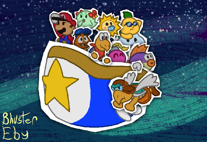
I love the original Paper Mario, as it's an enjoyable story and experience. It also doesn't lean too much into the whole "paper" idea, which isn't to say that the other games are garbage because they do, I've enjoyed quite a few things from those games (although as of yet I haven't even begun streaming the sequel, so my actual opinion on it hasn't been formed right now). However, stuff like the logo look like they've been cut out of a sheet of paper itself, so I thought "what if I made this one look like the characters were actually on some paper?"
Well, here we go.
There's only a few problems I have with this piece is the star ship and Parakarry. The ship is just alright, and could've been better, but Parakarry is the only one here that I actually think I should've redesigned a bit. He just looks a bit janky, especially with his head and satchel.
Everyone else I like how I did them. Out of them though, I think Kooper, Bow, Spike, Watt, Bombette, and Goombario are the best drawn.
The paper cutouts were made by setting each character on a white background, and then using the angular selection tool to cut out the rest of the background, leaving a jagged cut around the character. I did this for the ship and the hands of some characters too, to give off an illusion that they're holding onto the rim of the ship. For each "cutout," I apply a drop shadow on it, making it look like it's sitting on top of whatever it's above.
The background is probably my favorite part. I tried giving it more of a painted aesthetic, plus one last stroke of paint making it look like the star ship is sailing through space. Top-notch quality.