My Avatar redesign
So let me explain in excruciating detail how I designed the redesigns for my avatar's design.
Hello.
I just like drawing my avatar(s), don't mind me.
Anyways.
A while ago I saw a video in which someone made art of a viking warrior relaxing after a hunt/fight. I loved the picture, but I noticed something that this person did before they started drawing lines. They took a big, texture brush and made a silhouette.
Now, I've been used to drawing little guides to help me draw the actual linework of my drawings, but looking at this person using a concept that I guess I've never thought of was pretty cool, so I wanted to test something out.
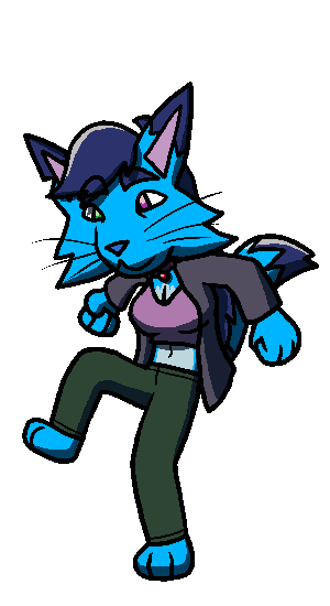
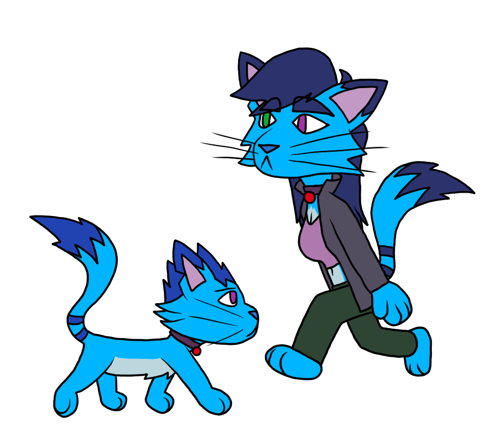
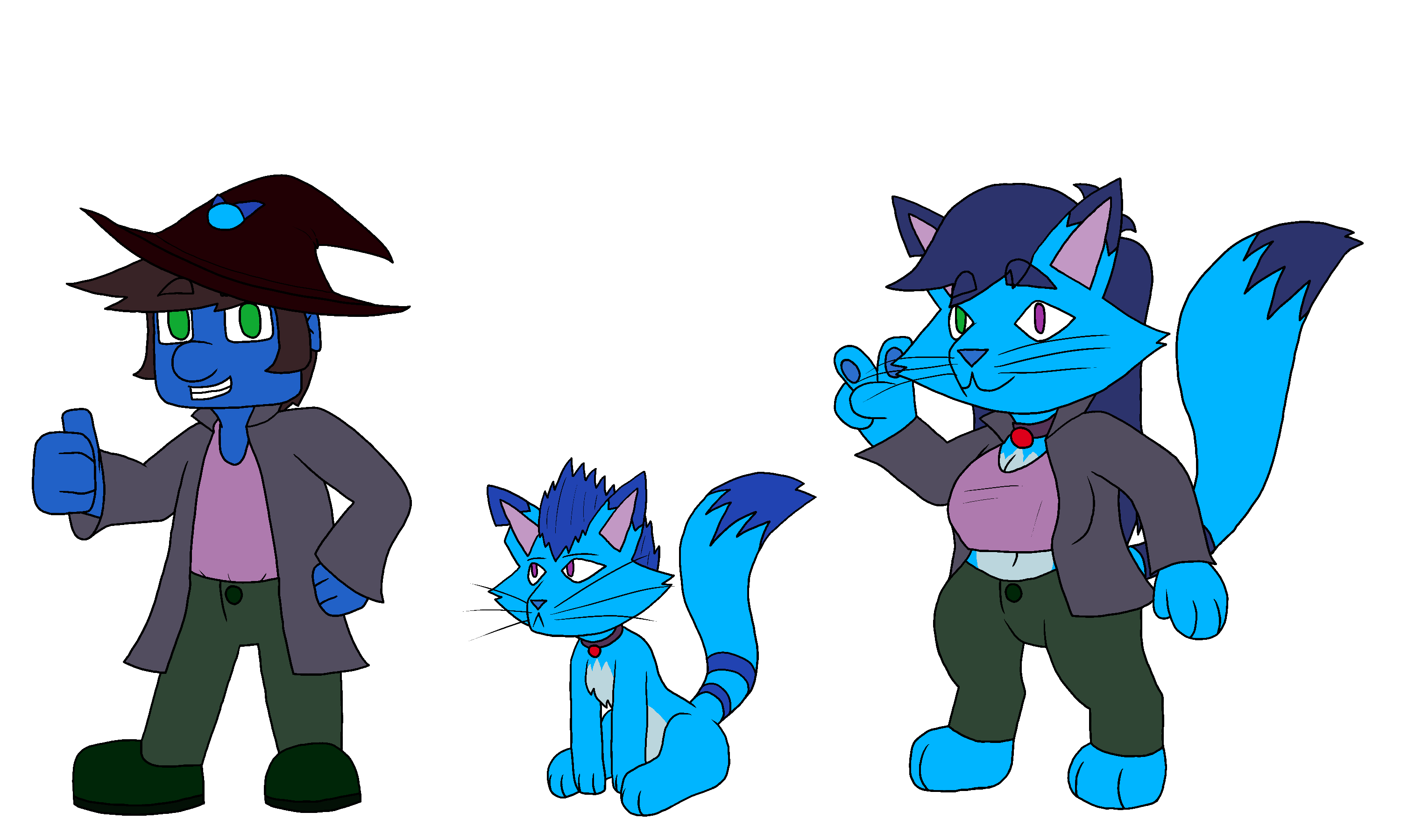
I did a previous picture of my avatar a little while ago, and I grabbed each character, removed the shadows to get their full colors, and put them on a textureless background.
Now, I still love these designs, and they still have basically the same features (colors and clothes) that I kept in my redesign. However, despite me thinking that they're good, I felt that I could do better. Just by looking at this, you can see the biggest change that occurred: their forms are now different.
So, I'm going to show you my progress in my design, and explain certain things about my process & my art in general.
Without further ado, let's get started.
Silhouettes

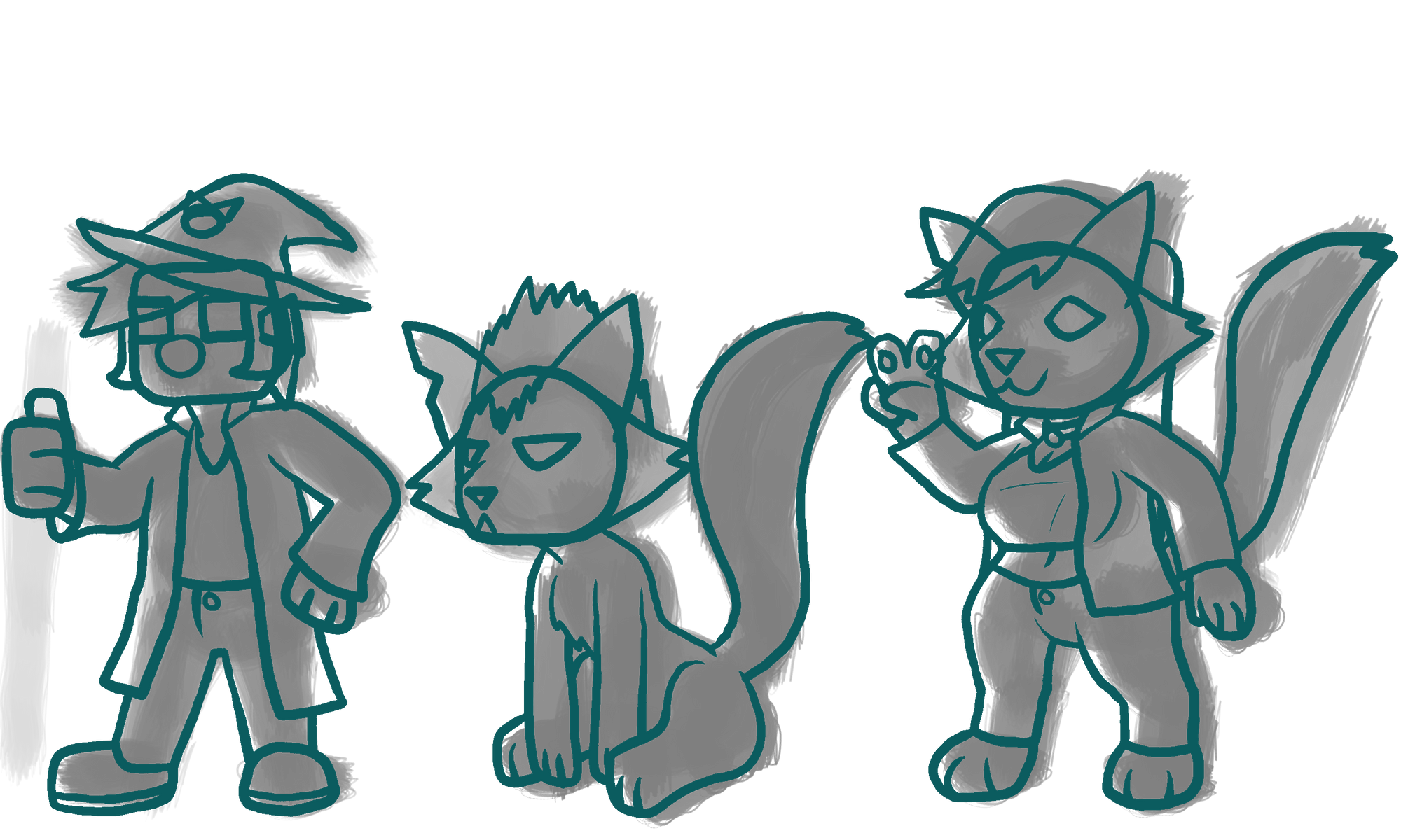
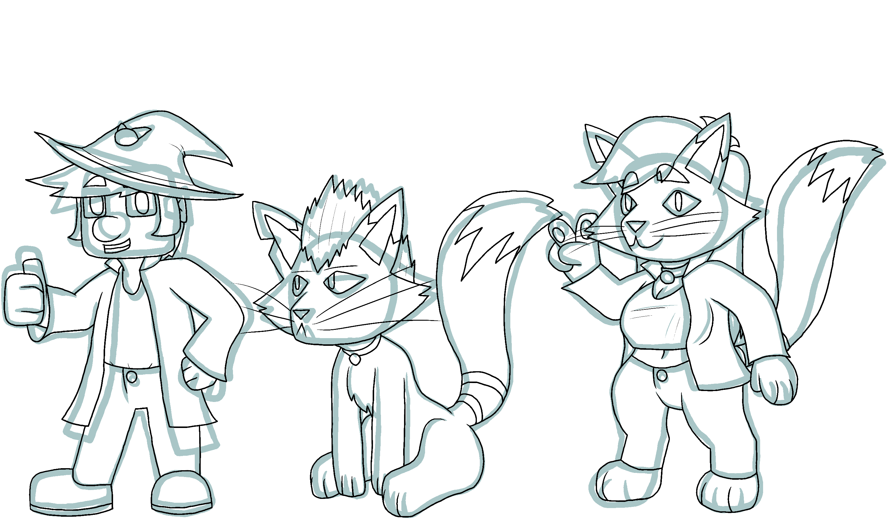
I had some ideas for my new designs. First off, I wanted to make them a bit chubbier than what I originally drew them as, which is probably best described as a cylinder body. The reason why Bramble's silhouette is huge is that these were all put on a different sized canvas, and are only put on the final canvas for showcasing what I did for my character.
So, I mostly did this to try and get my avatar to have a unique form. If you were to put the previous Bhuster and Brustle's form side-by-side and make it all black, the only differences are their head, a tail on one, and Brustle's breasts.
It still looks cool, don't get me wrong, and it's still effective, but I feel I could do better than having a different head and other very minor details.
With different forms, you can make them easier to distinguish from each other and point them out. If you want a good example of such a theory, take a look at either group of survivors from Left 4 Dead. No matter if it's Bill, Louis, Francis, and Zoey, or if it's Coach, Rochelle, Nick, and Ellis. Their characters were designed to both fit with each other & to distinguish their characters enough to find them in the shadows.
While I only really have to worry about that with two of my characters, I still wanted to make them be more different.
(also before we move on, I know that they both are pretty big now, but there's different shapes that make up their bodies now, not to mention the fact that their bigger similarities showcase that they are the same character)
Now, the other reason I wanted to mess around with silhouettes is because of posing. Maybe you had a hint of an idea, or maybe it's clear as day to you, but I have trouble with poses sometimes. With silhouettes, it felt a bit easier to find a pose since you're making a vague form, so feeling out a pose with this loose form felt easier than, say, sketching out a pose or drawing shapes as body parts while putting them in a vague pose.
(also a friend of mine still had to help me with the pose, I couldn't figure out what Brustle's left arm should be doing while giving the peace sign)
One thing about doing this that helped with this step in making a pose is that the brush I was using became more opaque (solid; non-transparent) the more it was applied / the more pressure you used. I know mine is sloppy, but because I knew these characters well and knew what I wanted with them it didn't hinder me too much. I just need more time to experiment with this in order to get a better starting silhouette.
Loose Sketches
Next up is a loose sketch. I do this to showcase where I want to put certain things, and build off of shapes to keep consistent and keep form intact.
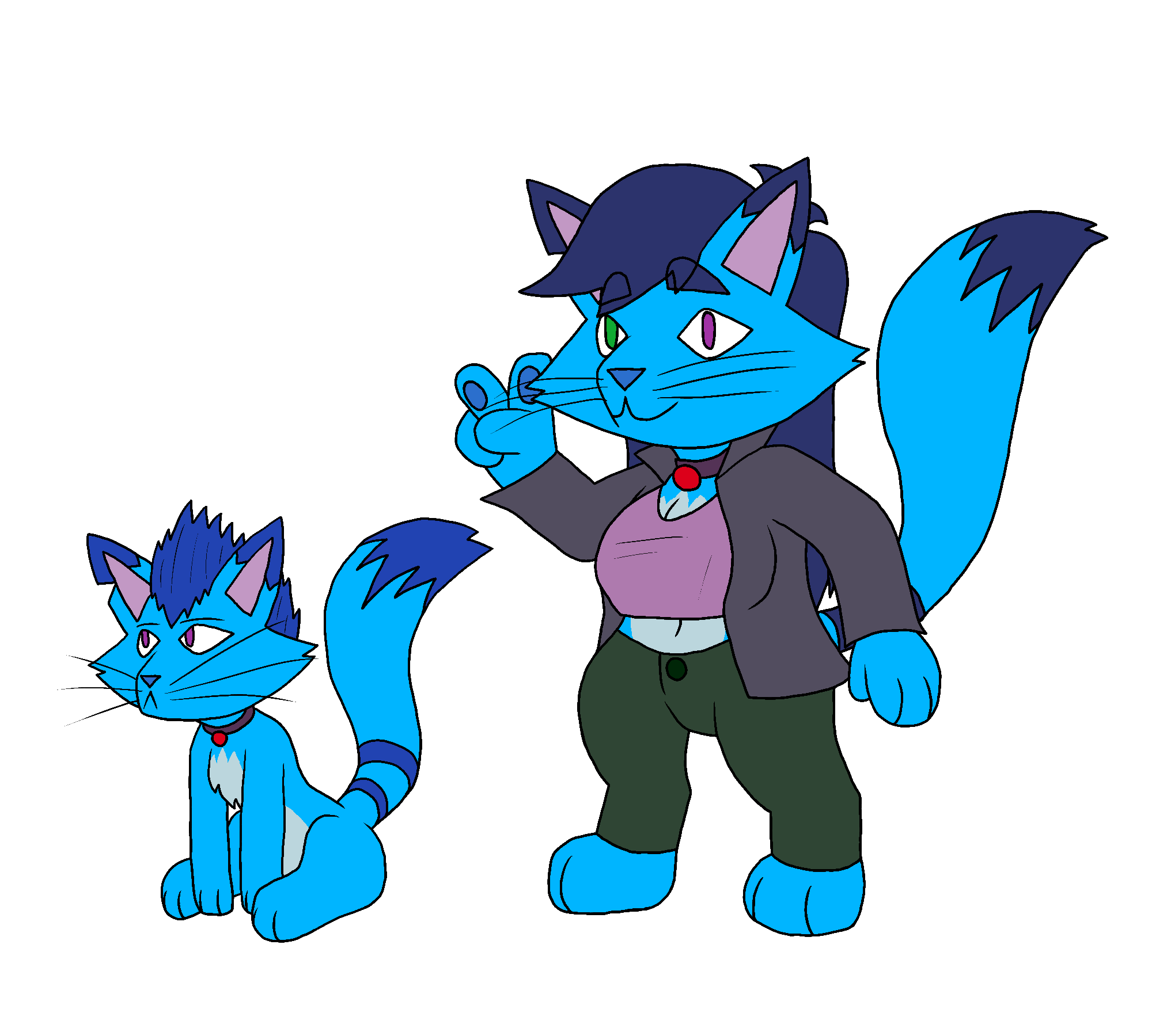
First off, I had originally wanted to draw Bhuster holding a staff of sorts. I decided against that in this step since I would have to design a staff. So instead he's giving the good ol' thumbs up. Second, I forgot Bramble's collar, despite putting it on Brustle. I don't know how I forgot.
Well, I guess maybe I do. I did stay up a while last night drawing the line art.
But aside from that, I don't think I have too much to explain about this step, it's pretty self explanatory.
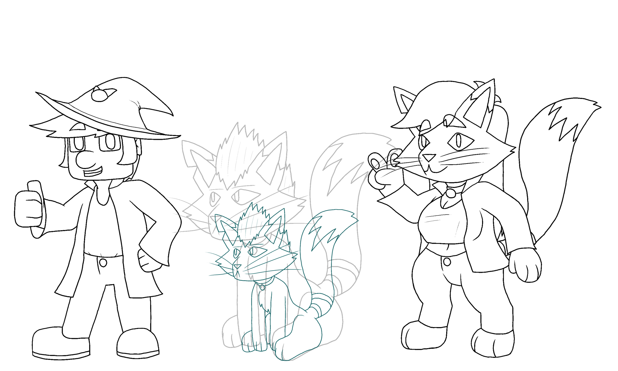
Line Art
Yep. Line art. Should be similar to the previous step in its simplicity. The only difference being that I add the actual details, I get Bramble's collar on her, and otherwise just getting everything in the right place.
Since this section was quick, I want to talk about certain design stuff that I wanted to implement in these characters.
I mentioned chubbiness before, and the reason why I made them that way is twofold. While I'm not one that could be called fat, I'm not that skinny either. I have a bit of a belly. So instead of having my avatar be thin I wanted to make them a bit more like me. My other reason is to make them more cute. Well, Brustle looks cute. Bhuster's head could use a bit more of a rounded shape, but he still looks good to me.
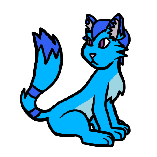
As for the cats, their previous designs have weirdly shaped cheek tufts.
This is a part of Bramble's design before I came up with Brustle. In fact, Bramble's hair used to be different too. It was supposed to be some sort of weird bobcut that curls in the back above the two chunks of cheek tufts.
The only reason why she has her spiked hair is because a friend of mine (the same one) drew Bramble to help me learn some art stuff, and she interpreted her hair as such. She drew the cheek tufts different too, which is why I wanted to change that about her design.
Yea, I could've done it earlier, I don't know why I didn't consider that aspect either.

As you can see, this style makes them look more like, well, cats. For a cat character, that's kinda important.
The final point before moving on to the next step is the legs of the cat characters. I decided to not draw outward paws from Bramble as she's sitting, which I feel is a good choice. It makes it simpler while still conveying that she's sitting up. As for Brustle, her legs were made to be a bit more animal-like.
Shrink


Just shrinking Bramble's lines down to appropriate size, then using that as a guideline I redrew her (since I don't want to use the blurry lines that formed when shrinking her down).
Color
Now it's onto color. I guess I should explain why I chose these colors here.
Their main colors (Blue and Cyan) are my favorite colors.
...what, you want a deeper meaning? One that explains their motives and personalities?
They're just cool colors (no pun intended).
Now, there was a tip I've learned about choosing colors for something. It's okay to make different shades, tints, and values of the same color to fit into different areas.
In fact, if you were to make every color its base hue in the pictures, these are just about the colors you would find on each character:
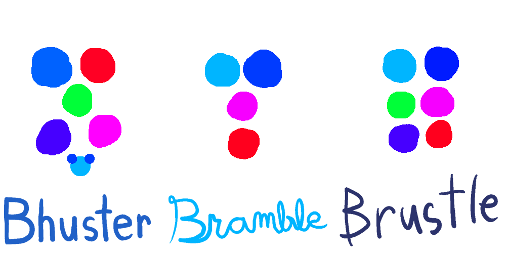
It's basically Blue, Magenta, Cyan, Green, and Red, with just one little thing of Blueish Purple in Bhuster's. Otherwise, that's it.
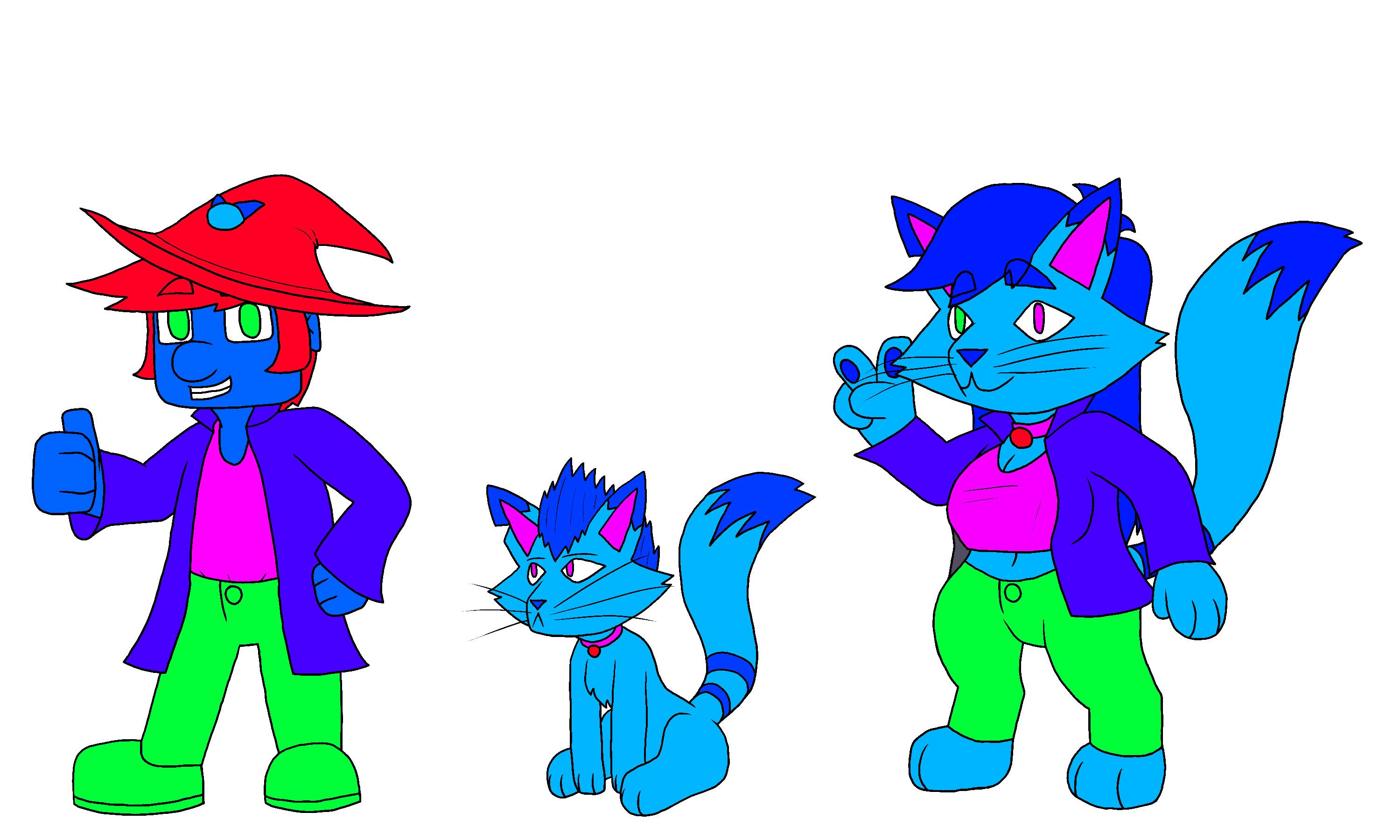
Here's what they would look like if I didn't mess with the different attributes of each color:
So why do the values matter? Why affect the shade, tint, and value of the colors?
Well aside from preventing eye-strain like you're experiencing now, it has other advantages: it nets you different colors from a limited palette & it lets you highlight certain things about the characters.
Regular characters

Base hue characters
If you look at this bottom one, the characters' values are just about the same, since they're all so bright.
The top one, on the other hand, shows different values in order to convey certain things, usually important.
For example, Bhuster's hat and shoes are dark, making them stand-out features that he has, which the others don't. Bramble's collar is a bit darker than the rest of her, providing an accent and a clear distinction on where her head connects to her body. Brustle takes Bramble's collar with Bhuster's clothes, and combines them. Plus, since her hair color is different from Bramble's, it makes it a little bit darker.
(for reference, I got Brustle's hair/pattern color from merging both Bhuster's & Bramble's hair color at 50% opacity, then making it full opacity)
All in all, if you want to use color effectively, you have to use both its hue & its value to help others see the important parts. Don't worry if you don't know how to do that effectively yet, I'm the same.


So there you have it. That has been my art process for making the redesigns of my avatar. I really enjoyed myself while doing this, which is good since, as an impatient person, I don't like when things take too long for my liking. The silhouettes I feel really helped out the process, especially with a more natural pose for all three of them. I definitely will be trying this out for other things.
I look forward to posting more art, and possibly my art processes as well. Until then, cya.
Yes, I know Brustle has huge tits. Is there anything wrong with that?